After finishing the concept side of the project, I moved
onto creating assets for the level. I began modelling low poly rock shapes in
3ds max, with sets of three, two large, two medium and two small, I then
imported them to Zbrush so I could begin sculpting. While sculpting the rocks I
used the clay bush and slash to add cracks and errored edges, alongside the
high polish brush to create sharp edges and flatten surfaces.
Afterwards duplicated and Zremeshed each model to around 700
or less, then exported all high poly and low poly meshes, so I could open then
in 3dsmax to begin unwrapping and baking the normal maps. I then continued to
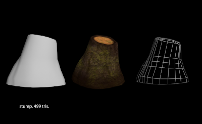
create multiple other low poly assets, such as grass, stool, a tree stump,
reeds, roots, a plate, a wine bottle, a tree mushroom. While making these I
creates low poly models in 3ds max and unwrapped, I made sculpted details into
a few of these assets such as the roots, stool, tree stump and plate, so that I
could bake details into them like bark on the wood and cracks on the plate.
I also created a Mother tree and some fairy windows and
doors. I created low poly models in 3ds max then imported them to Zbrush to
sculpt wood details and shape. While sculpting the windows and doors I added
door hinges, wood planks and reinforcements on the wooden planks, I also used
the mask tool to paint out areas of detail which I could inflate and have risen
above other areas. I could now then repeat what I had done with all the other
assets, which I unwrapped and baked in 3ds max.
Once I had Finished Modelling, unwrapping and baking
everything I could move into texturing. For all my assets I used photobashing
and painting, I used photos as a base layer then painted over the top using
blend tones to create a semi stylised texture. I tried using more vibrant
colours for the wood textures, as the level would be set at night and the
textures need to be visible.
After I had finished all my assets and imported them to
engine, I worked on creating PBR materials for my meshes.
Afterwards I created
the vista background of trees and the ‘begin play’ button for the menu screen.
Overall I am very happy with our team effort and what we
have accomplished. I feel it is a good representation of what we initially wanted
to create and captures the theme of midsummer night’s dream. The level doesn’t
100 percent reflect the concept we created, however the concepts were there to
help towards developing the look of the level and understand the atmosphere and
lighting. As well as the paint over I created, helped build the layout of the
level. All my assets within the level work well with the whole scene and fit
with the style guide, they show high detailed normal maps with lower detailed
textures. The whole level works well together and flows and the player
progresses, however the lighting is too dark and need a better balance from
dark to light, as some of the light is too strong. If we had more time I would
like to add more features to the level, to enhance the enchanted forest feel,
such as more wisp’s, glowing foliage such mushrooms and lily pads, which I feel
would make the level feel more mystical. I would want the level to resemble the
menu page more.


No comments:
Post a Comment